Who hasn't been in this situation when you are using a smartphone app or a webapp on the PC and you make something completely wrong, sometimes even with no option of going back? If someone says that he or she doesn't, either he/she is lying or he/she has never used an app.
But, who's responsible for this error? The easiest answer (specially for developers) it's always "the user". But nevertheless, if the user is doing something wrong, it's because there's something wrong or that can be improved in the app. There exists two different so called "user errors": slips and mistakes.
Slips
Specially nowadays that everyone has one or more smarphones, and that we even use them more that a PC, slips tend to appear in everyone's daily routine. For example, you have an appointment next week and you don't want to forget about it, so you program a notificaion on the smarphone's calendar; but when you are going to save the appointment, you mistakenly tap the "Cancel" or "Delete" button. That's exactly what an slip is, when a user is trying to do something, and it ends up doing something different. As pointed before, this is now more common than some years ago, since commiting this type of errors is easily with today's smartphones and its touchable screens.
Ironically, this type of errors are more common in expert users rather than in novice ones, since they tend to appear when the user knows what he/she is doing and he/she is trying to do it so quickly and/or paying just a little bit of attention that he/she commits this error. There are some ways for trying to prevent this kind of errors, which are going to be explained next along with some examples. Generally, this strategies are centered on guiding (or trying to) the user to stay on the right path for doing what he/she is trying to accomplish.
Constraints
This sounds like limiting the actions that the user can do in the app, but sometimes it's exactly what we want to do, or even what we should do in order to prevent a bad o wrong use of the app. Usually in this kind of situations, there exists some rules that define the good and bad use of a certain functionality of an app, or event the whole app. These rules are the ones that can be used to limit the user actions and, therefore, preventing a slip-type error.
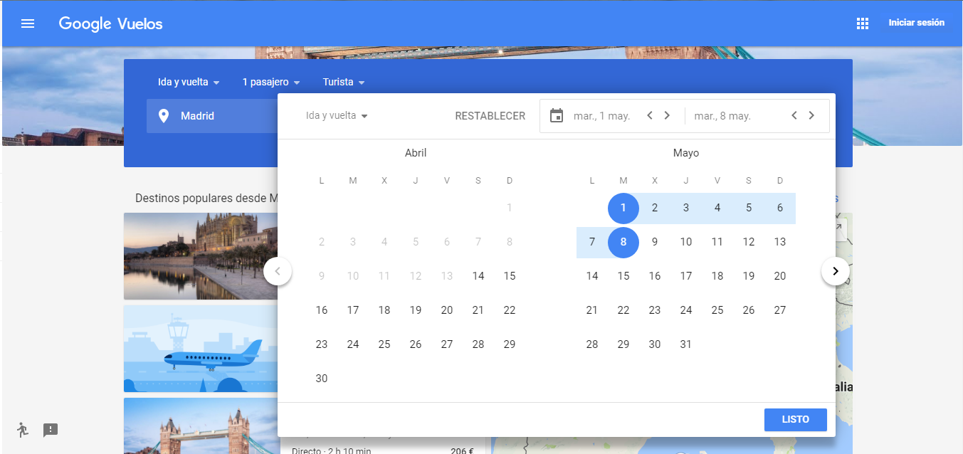
One common example are date-pickers on websites or apps for buying travel tickets, like for train or plane, or for booking a nice hotel by the sea. In this kind of situations, the user should nevee be able of selecting an end or return date that happens before the starting date.
Google Flighs, for instance, has a good implementation on this matter when selecting dates on its calendar. Once you select your departuring date, the app will only allow you to select a later date for the return ticket. If you try to select a date before the departuring one, this will be set as the new departure date. On the other hand, if you try to select your returning day first, the app will automatically set a departure date for you (although how the it selects a date it's a mistery, since for today, april 14th, is selecting by deffault april the 30th. Maybe Google knows there's a bridge on that date in Madrid?).
All this useful functionalities for preveting user slip-kind errors is also backed up by a nice UI design that shows you in a different color the range of dates that you have selected or that you are going to select.
Suggestions
As already said, slip-type errors a more common nowadays with smartphones and their touch screens. In fact, typo errors are slip-type errors, and I would say these are the most common ones. Writting on a smartphone's screen can be a pain sometimes, and it's definetly not as easy as with a keyboard; therefore, typo errors appear all the time.
Because of this, when searching for something in an app, most of these apps offer suggestions based on what you are writting or, most accurately, what you are trying to write. This way you have both, less probabilities of commiting a typo and more possibilities of finding what you are looking for.
The example in this case could be the Google Play app for downloading apps for Android phones. There are millions of apps that can be downloading, and a lot of them have weird or complicated names, both to remember and to write correctly, specially if you are doing it quickly. Taking this into account, the Google Play searching engine offers suggestions based on what you are writing. Also, as it can be seen on the image, the Google Keyboard also offers word that can match with what you are typing, as usual.

Defaults
This one is also related with the example presented with Google Flights, as I was also briefly talking about the default date that the app was choosing as departure date. As you yourself has probably experienced, when you are doing some task that you do on a daily basis, or even more than once a day, you usually want to do it as fast as possible for not loosing too much time. To this end, some apps offer default options that can help the user to complete this task quickly and, more important, without commiting a splip error if trying to do it manually.
One good example, going once again with Google apps, is the Google Calendar App. It's quite common to set an appointment in the calendar, and you want the app to remind you of this appointment with some time in advance, even more than time or using different notifications (like current smartphone notification and email notification). Taking this needs into account, the Google Calendar app provides a set of default options to select for reminding the appointment, which are by the way improved with previously selected options by the user.

Forgiving Formatting
And just to finish with the slip-type errors, a formatting improvement that it's quite easy to provide and at the same time enormously useful: the forgiving formatting. This is based on a very simple principle: we humans are not good to remember things that we've just done, specially if we have to remember something specific, like information with an specific format. Besides, remembering long numbers is also not our thing, but we can do it if we split them in shorter chunks if it's a long one.
To this end, when we have to input a number in some form, like for example a phone number, developers should be focused on displaying this information for humans and not for computers (of course this will be not readable for a computer, but that's an easy problem to handle without the user having to suffer it).
And how is this related to slip errors? Well, if you understand something easily, there'll be less probabilities of you commiting an error. For instance, a chunked phone number is way easier to read than all the numbers one after the other, so you will be sure that you have introduced it correctly. Furthermore, preventing the user from introducing anything that shouldn't be introduced, also prevents a lot of errors. This is, if the user has to input a phone number, do not allow him/her to introduce any character.

Mistakes
Now that we know what's a slip and how could be prevented in some ways, what's then a mistake? Well, a mistake differs from a slip in so far as that in a slip is the user the one that makes something wrong, while in a mistake the user is not, but it's not doing what he is supposed to. Once more, this is not usually his/her fault, but the developers, since the app is not giving the right feedback or not providing the information correctly.
A silly example of a mistake could be that a user doesn't like to set a custom ringtone for his/her phone when he/she is being called or for the alarm. If the default ringtone for incoming calls is the same as the default ringtone for the alarm, it's quite possible that when the alarm sounds, the user will try to answer a phone, with no succesful outcome. The user is acting correctly: the ringtone for an incoming call is ringing, so he/she is trying to answer it. Nevertheless, it's not an incomming call, but an alarm that he/she has to snooze. Thus, the information that the phone is providing (using a sound) is ambiguous and because of that the user is commiting a mistake.
While this is not an interface, the main problem of why the user commits this mistake is the same: he/she has an incorrect mental model of what is related to an action. Therefore, the user tries to accomplish a goal that doesn't match with the situation at hand. This mistakes usually happens when the developers' mental model of the app and the usrs's mental model doesn't match. Solving or preventing this errors involves understading the users' mental model and adapt the app to fit them, since they are not going to adapt to the developers' mental model. To that end, there are some useful strategies that can be applied, but for all of them to be correctly applied, there's one of them that is a must: gathering infomation about the user. If you don't understand it's mental model and the differences between it and the developers' mental model, appliying the other startegies will probably be useless.
Design Conventions
This is probably the simplest one of all the strategies to prevent user mistakes. If there's a design convention, a kind of standard, to design a part of the app's UI, then follow it. The user will probably visit hundreds or thousands of apps before arriving to yours, and these websites will probably have similar UIs for the same functionalities. If you don't design yours the same way for that same functionalities, the user will be lost and won't know how to do something, therefore he/she will probably commit a mistake.
Going back again to the Google Flights example, it's a convention to display with a grayish colour the previous dates that are not available to select, or even dates that are not previous to the current one but are just unavailable. This way, the user will know that in every app with a calendar, the ones that are marked in grey are not available and won't try to select it.
Comunicate Affordances
If there's no convention for some of the functionalities of your app, or maybe the user just don't know them, you can also show him/her how to use it. For intance, buttons hace usually rectangular shape with rounded corners and they also usually look that they are rising up, like you can push them. The way of doing this (this shadows, shapes etc) usually changes along with the design fashions that are continuously changing an evolving, specially in mobile apps. Another example could be text boxes, that nowadays usually tend to have hints showing what you can write on them. In web and desktop apps for PCs, for example, text boxes and clickable items are highlighted or their color changes to show that is interactive.
Preview
Sometimes users doesn't commit the mistake until is too late. Meaning, if the user has been working for several time and he/she is finally doing something with that work, selecting the wrong option could be catastrophic. Or maybe not even selecting a wrong option, maybe he/she just made all the work wrong from the begining because he/she didn't know the final results of what he/she was doing. Previewing this work before actually making an irrevesible action and, therefore, commiting a mistake, is a feature that can prevent a lot of user errors.
For instance, I'm writting this blog entry using the admin UI that Blogger provides, but I don't know how it'll look like in my blog with the theme that I selected it. I, in my case, have selected all the images with white background and not rounded corners, so if I didn't remember that, or even if I didn't know that cause this was my very first entry, I could end up publishing this entry with a black backgrounded theme in which those images with white background and sharp corners would look really ugly. Thankfully, Blogger provides a preview option to see how this blog entry will look like in my blog, with the selected theme and all.
Finally, just for wrapping up this blog entry, it's also important to know that, although they have been presented as different types of errors, there are some strategies that can help prevent both slips and mistakes at the same time. For example, whether if you tap the "Remove" button unintentionally or you wanted to remove just one picture but what you are really going to do is deleting the whole folder, a confirm/warning message should appear to let you know what you are doing and asking you for confirmation. Obviously, no app has Windows Vista as a refence for interaction design, so you should be careful to not abuse of this kind of confirmation messages. Besides, another approach for this functionality could be providing an "Undo" functionality in case the user did something unwanted.

References:
https://www.nngroup.com/articles/slips/
https://www.nngroup.com/articles/user-mistakes/
Comentarios
Publicar un comentario